Introduction
Duration: May 2018 - June 2018 (4 weeks)
Instructor: Karen Cheng
Team member: Ian Yu
My role: Designed 6 out of the 12 symbols. Unified all 12 symbols and designed the symbol showcase postcard. Drafted and revised the final poster.
Tools: Indesign, Photoshop, Illustrator
Design Challenge
Design a set of 12 unified symbols for Salon del Gusto. The symbols aim to represent the themes or amenities of the event.
Context
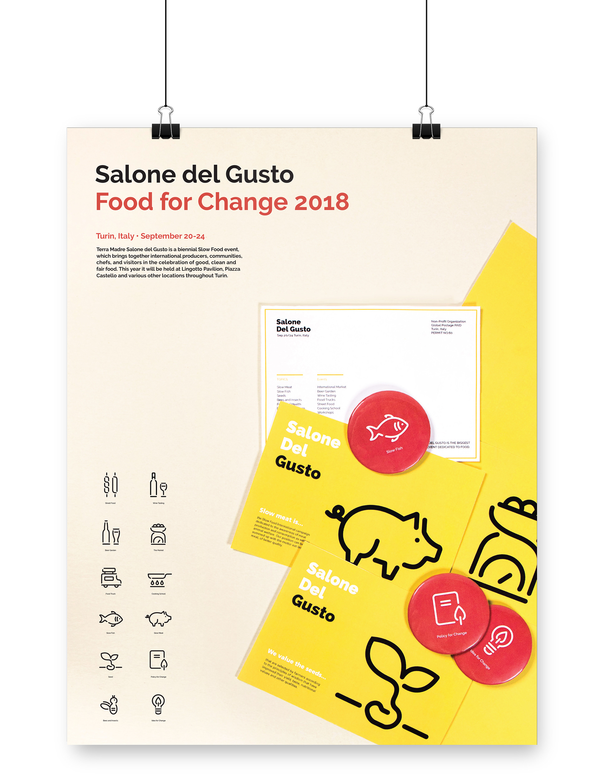
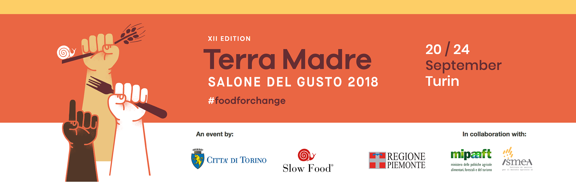
Salon del Gusto is a biennial Slow Food event that celebrates organic, clean and fair food. It took place from September 2018 in Turin, Italy.
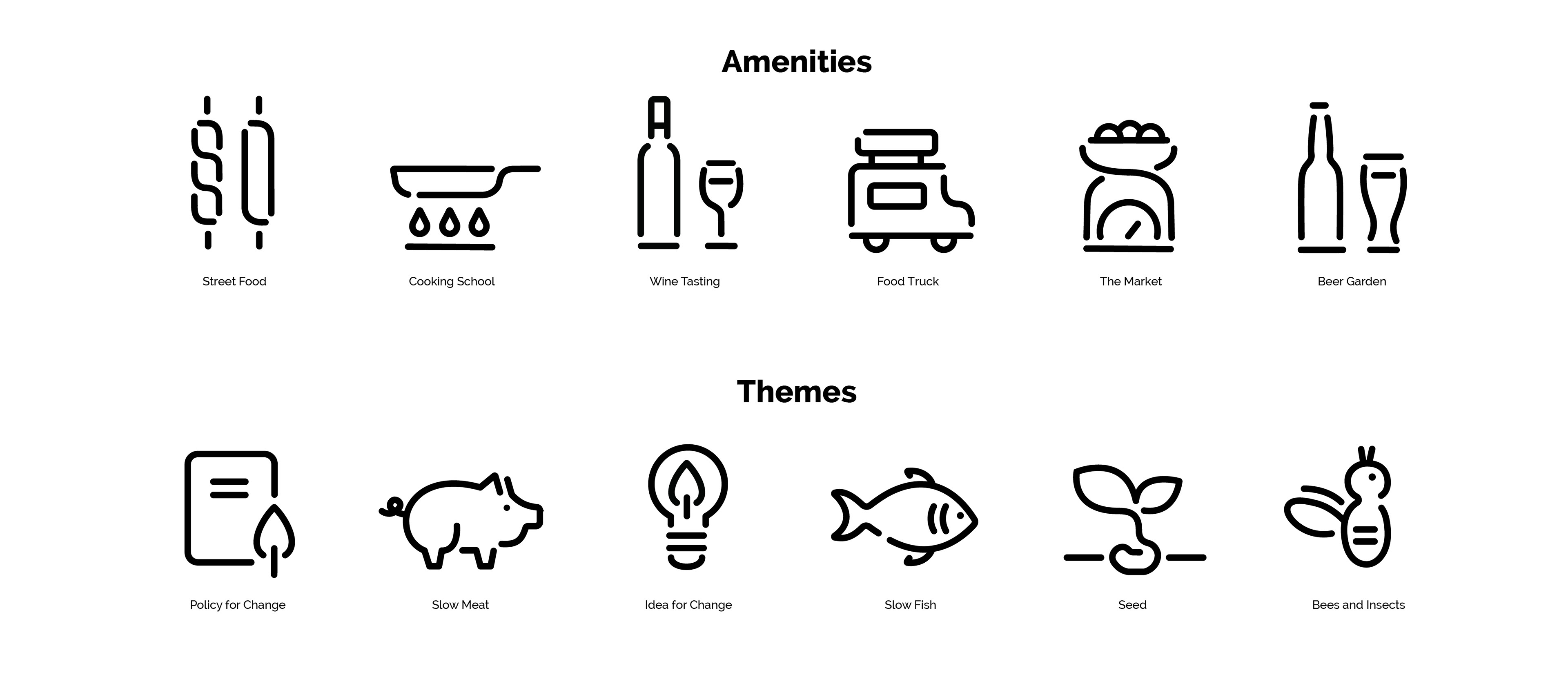
The following symbols are designed by me: Street Food, Cooking School. Foot Truck, The Market, Slow Fish, Seed
Design Process
Step One: Research + Draft 1
Researched about the event, and selected 6 amenities and 6 themes as topics for our symbols.
Decided on the targeted applications of the symbols: functional signages at the event and promotional by-products such as souvenirs.
Created first rough draft.
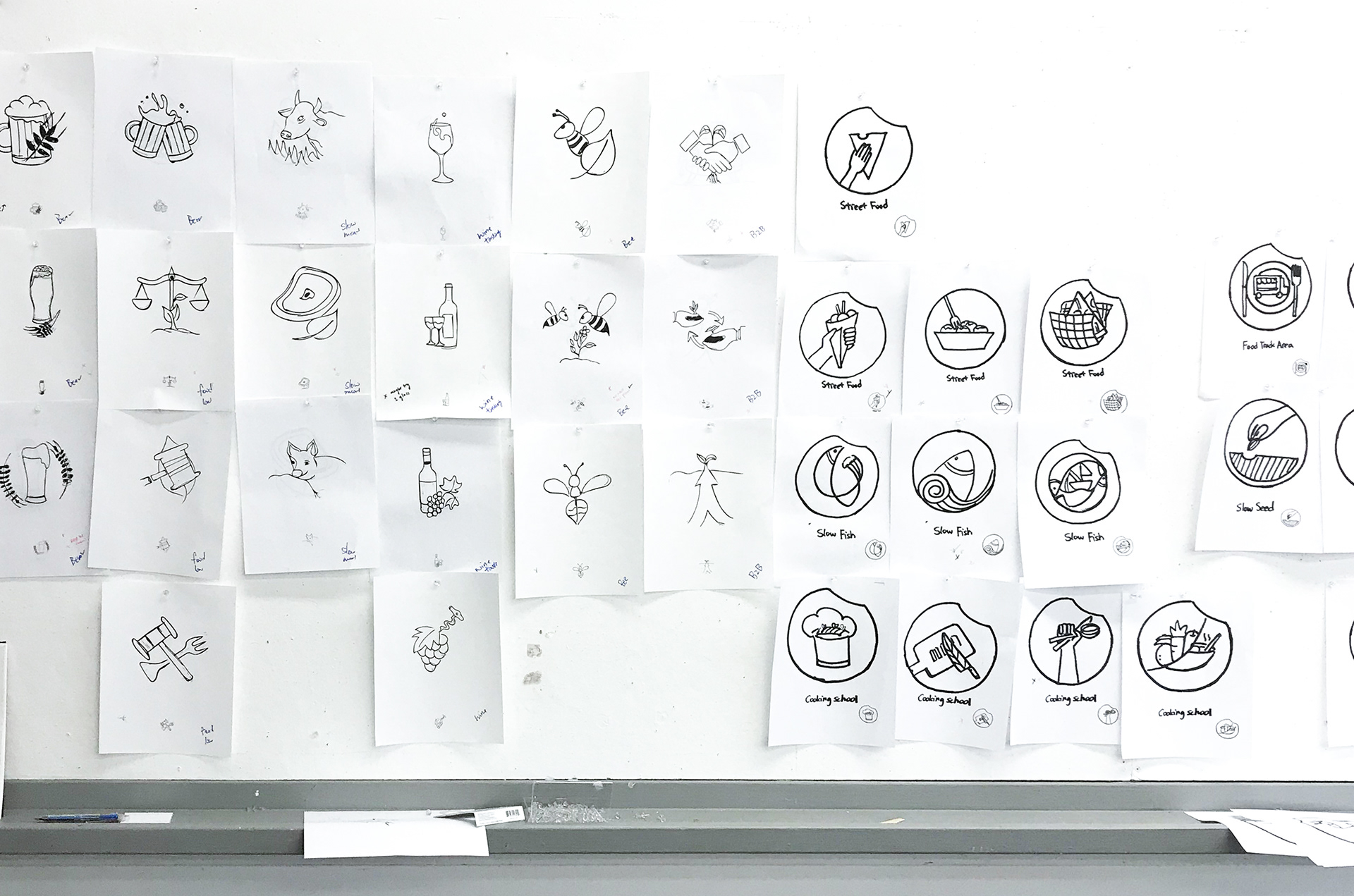
Draft 1 Critique Pin-up ( Left side by Ian Yu, right side designed by me)

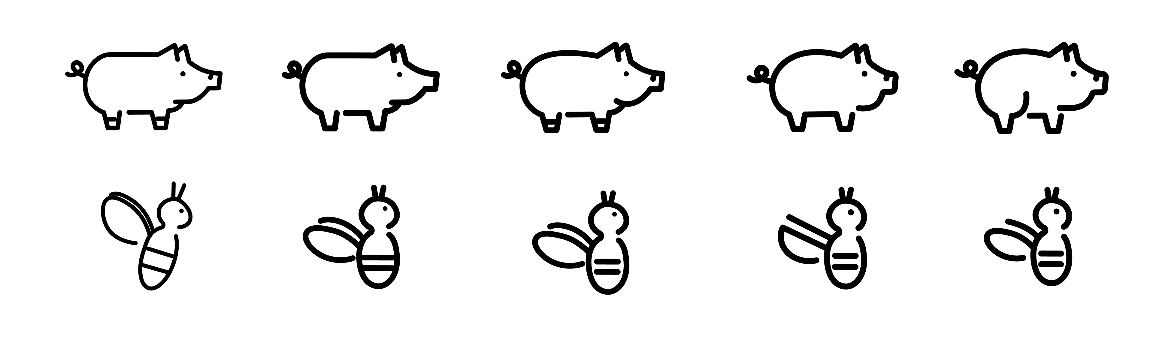
Examples of initial 3 variations for the symbols designed by me
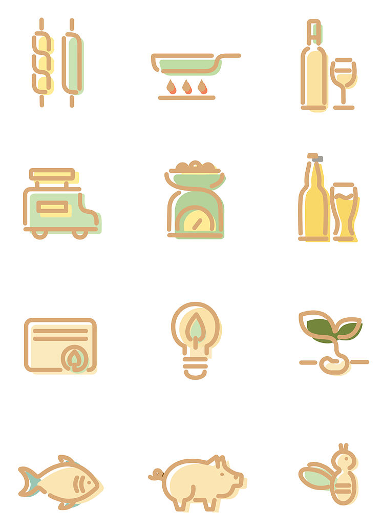
Step Two: Style Guideline + Rough Draft 2
Established a style guideline for the symbols to unify our visual style.
Style: line-based + balance between geometric and organic form
Why:
1. In consideration of the Italian aesthetics: elegant and organic
2. The event itself celebrates organic and naturally grown food.
Gaps between the lines: "take a break"
Why:
1. To communicate the concept of slow food by “breaking” the lines. (take a break and really think about the choice of food)
2. To create visual consistency.
Examples of how I integrated the gaps between lines in draft 2
Choice of line weight: thick strokes
Why:
1. Thick lines provide better legibility
2. Fit well with the graphic style (thick outlines) on the official website
Example of graphic style of the official website
Based on the guideline, we created our second rough draft

Draft 2 of the symbols designed by me
Step Three: variations + unifications
Continued to making adjustments to the symbols.
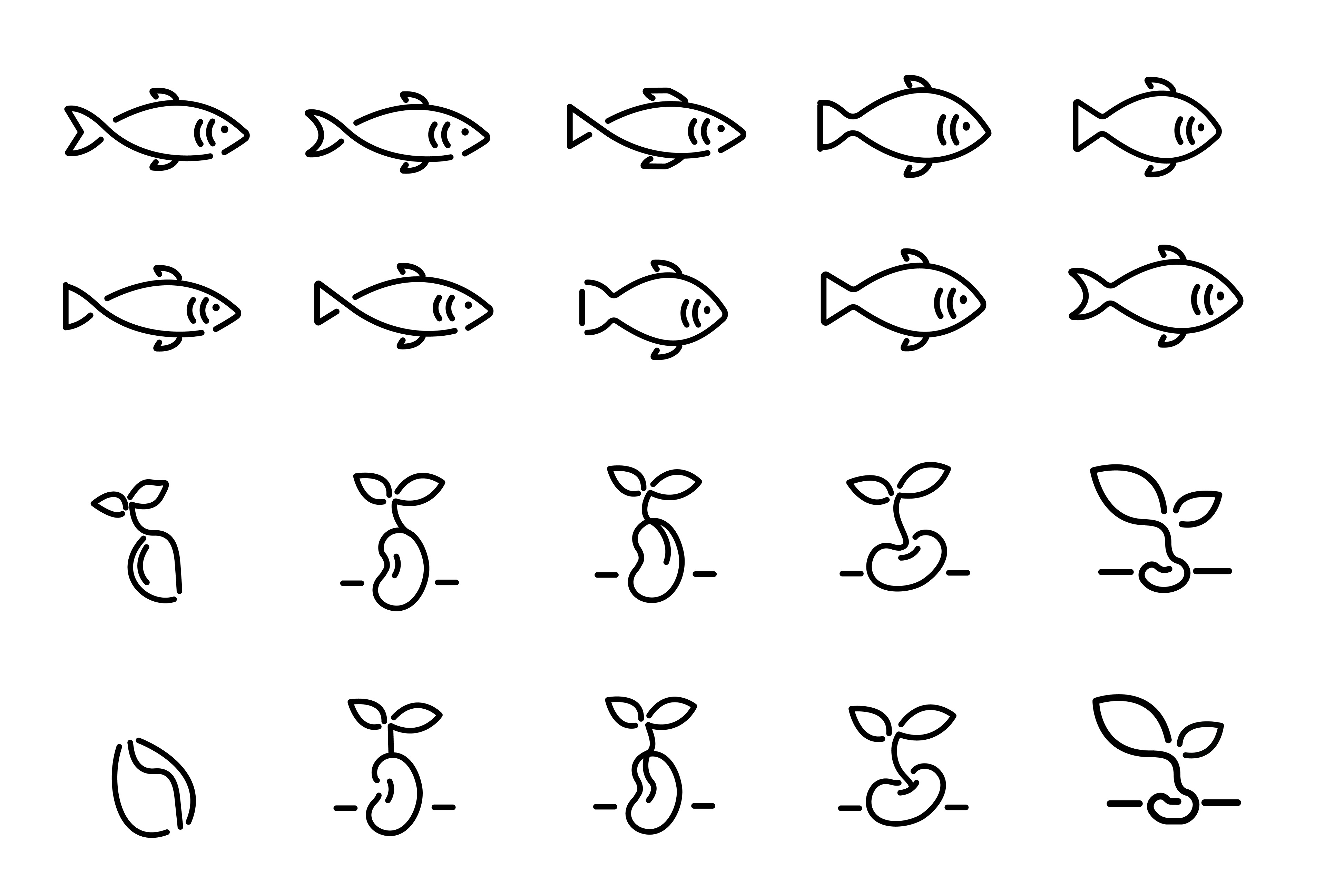
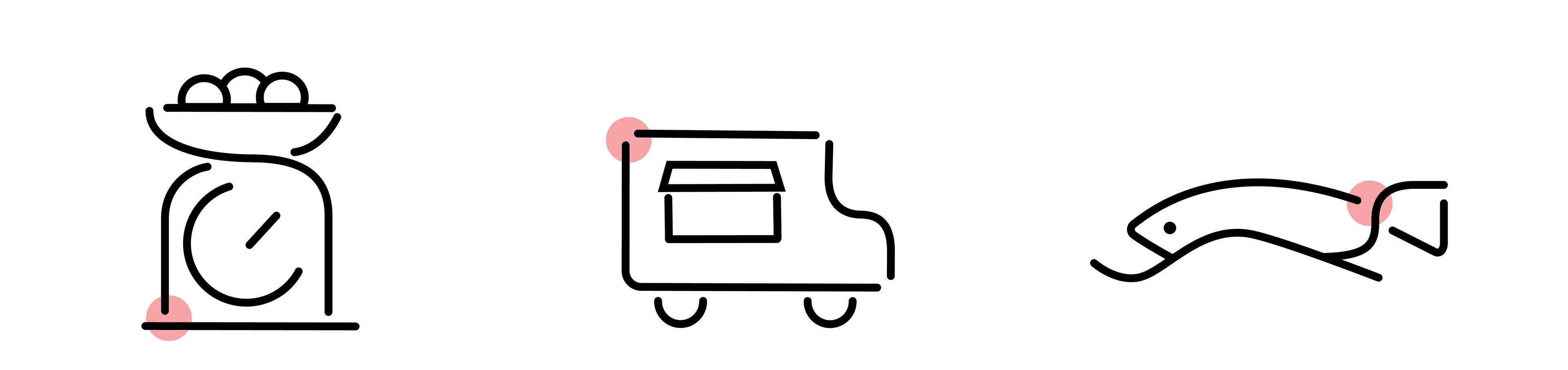
Examples of variations designed by me
Meanwhile, I was responsible for unifying all 12 symbols as a set:
1. made adjustments to the forms of the symbols,
2. Unified all line weight, the width of gap between the lines, and the level of details in each symbol
Examples of variations I made for symbols designed by Ian Yu during the unification process
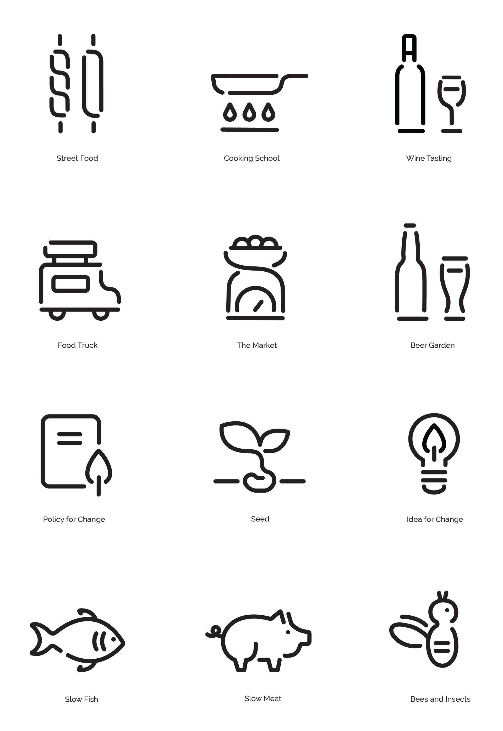
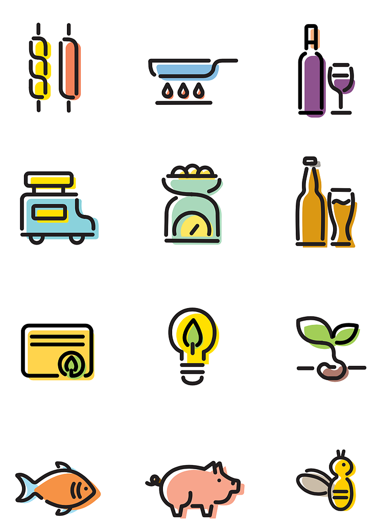
Final unified symbol set
Besides working on the form, we also experimented with different color palettes. However, we decided not to apply color to the symbols for the following reasons:
1. Leaving the symbols to black outlines make them more flexible to be applied in different context.
2. We did not find an ideal palette for the symbols.
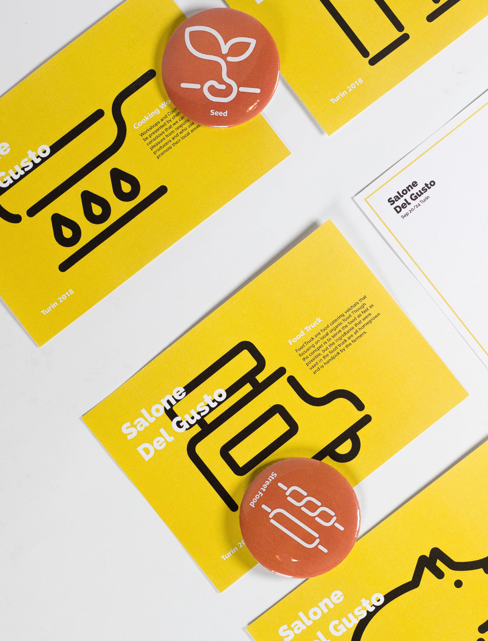
Step Four: applications + symbol poster
To showcase our symbols in its application context, we designed a series of postcards and pins as souvenirs of the event.
Draft 1 of postcards and pins
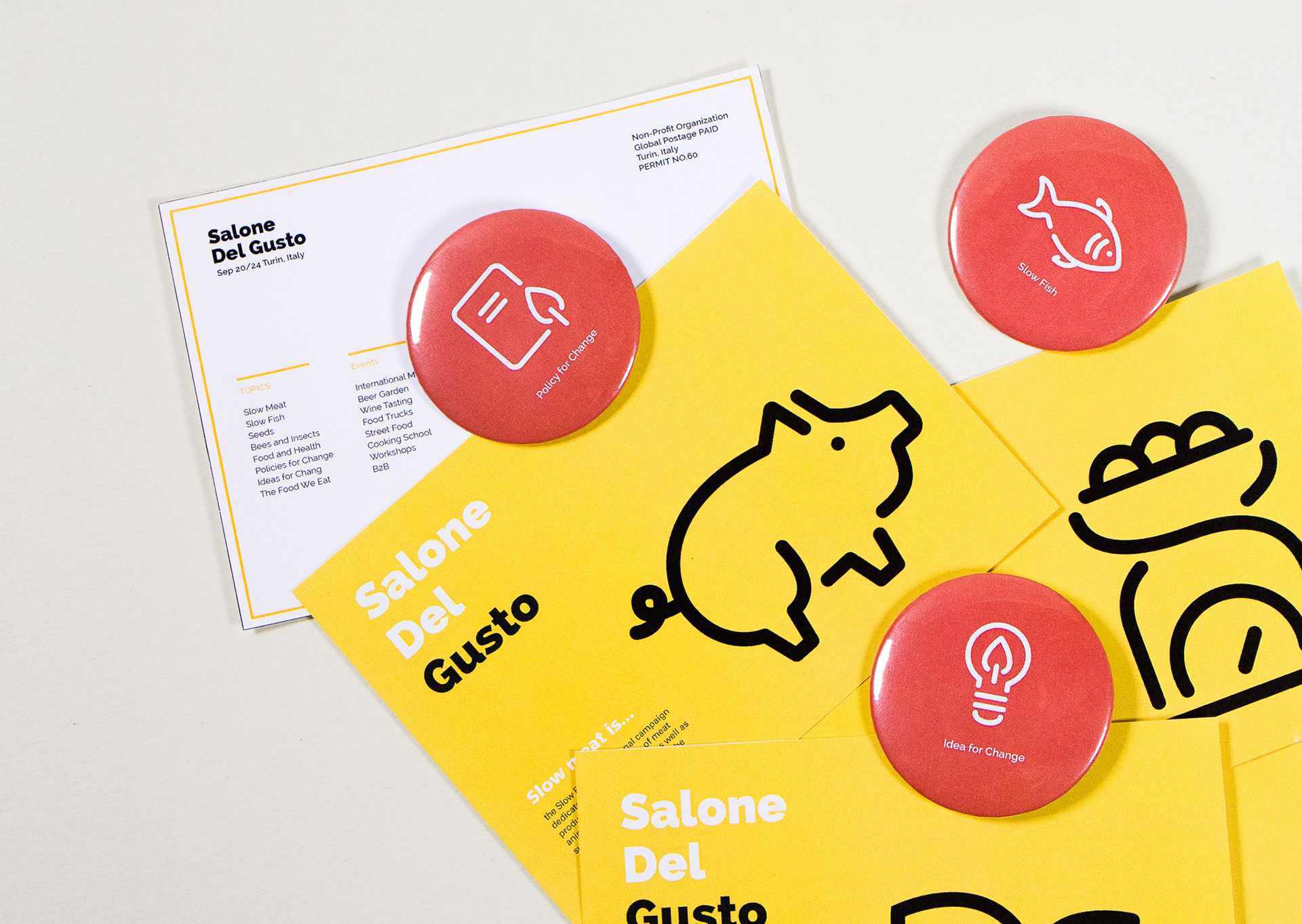
Final version of postcards and pins

Reflection + Action
Reflection 1: Communication is Key
It is challenging to work in a team for a graphic design project since individuals may have very different visual style. Timely and assertive communication is the key to solve disagreement and make progress.
Reflection 2: Style Guideline and Design Decision
Establishing a style guideline is a very efficient way to facilitate the teamwork. More importantly, as a team, we need to be conscious of and agree on the reasoning behind every decision behind the style guideline.
Reflection 3: Try and Fail
After ideation, it is important to go through “try and fail” process. Only did we actually make a lot of variations that we could clearly tell what was working and what not.
Action
In the future, I would improve the symbols by reconsidering how many gaps between lines do we need in each symbol and where they should be. The goal is to better unify the symbols with the gaps.
